The high-stakes challenge
Every global sportswear giant emerged in response to a cultural moment. Nike rose with the running boom in America, Adidas with Europe’s football culture, and Lululemon with the wellness awakening of the West.
SÉON is Africa’s moment.
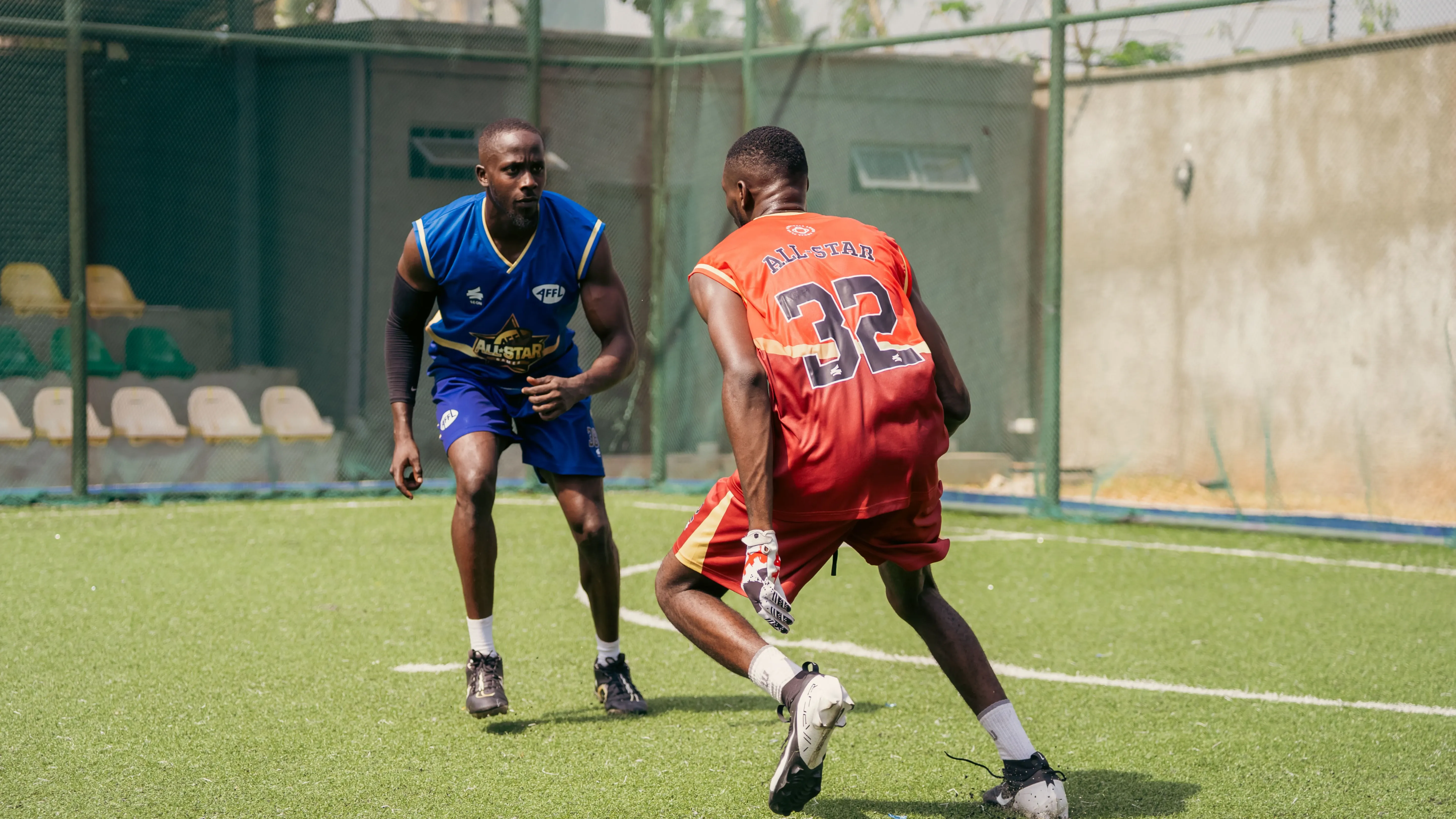
You’d find talent everywhere, across the continent, but the stage is still being constructed. While African music has earned global reverence by showing up with confidence, elegance, and self-belief, African sport is still underrepresented in the gear that tells the world: we belong here.
That’s the gap the founders of SÉON set out to fill. Not just by making sportswear and kitting teams, but by becoming the brand that would clothe Africa’s athletic future with pride, performance, and meaning.
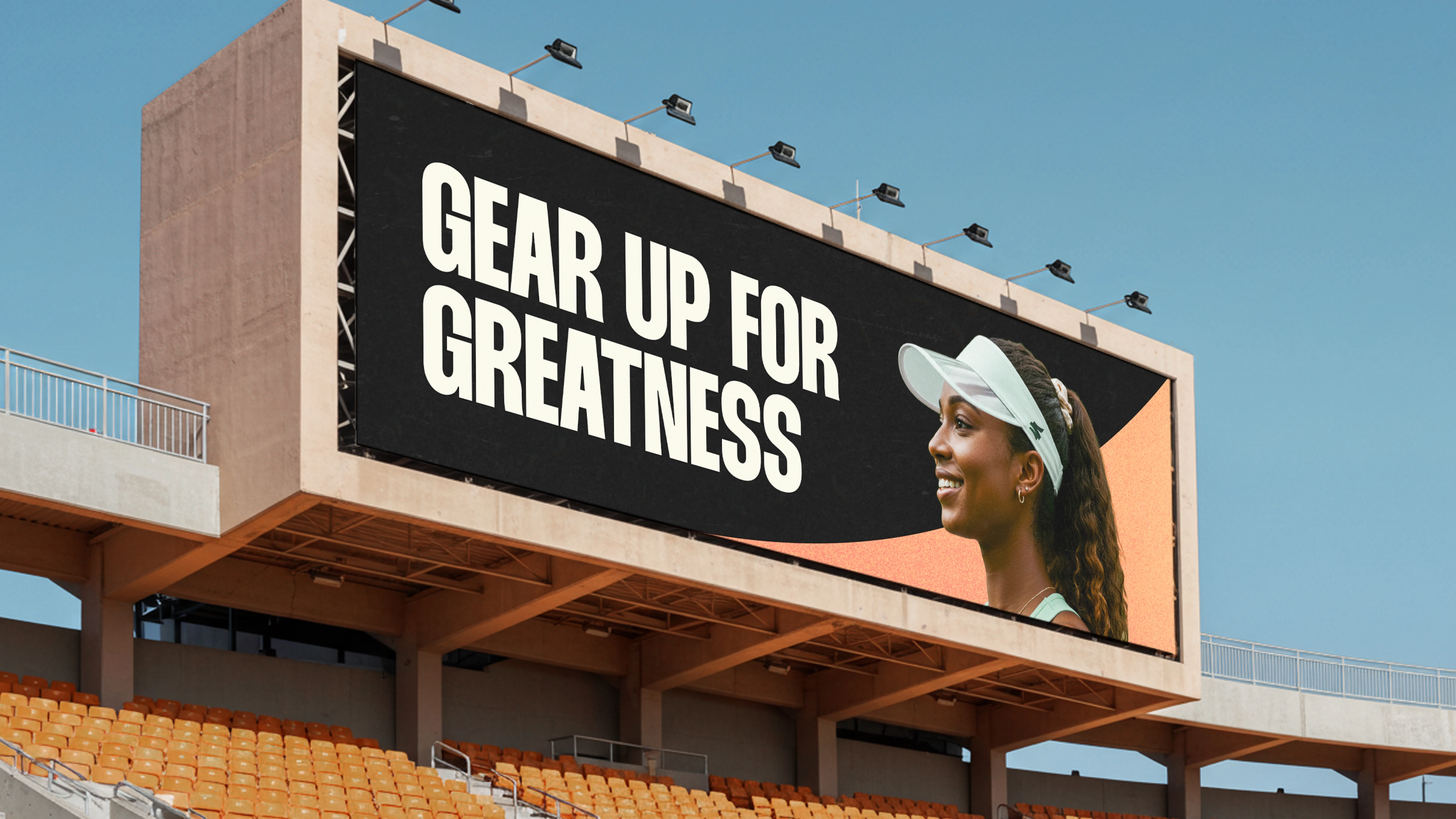
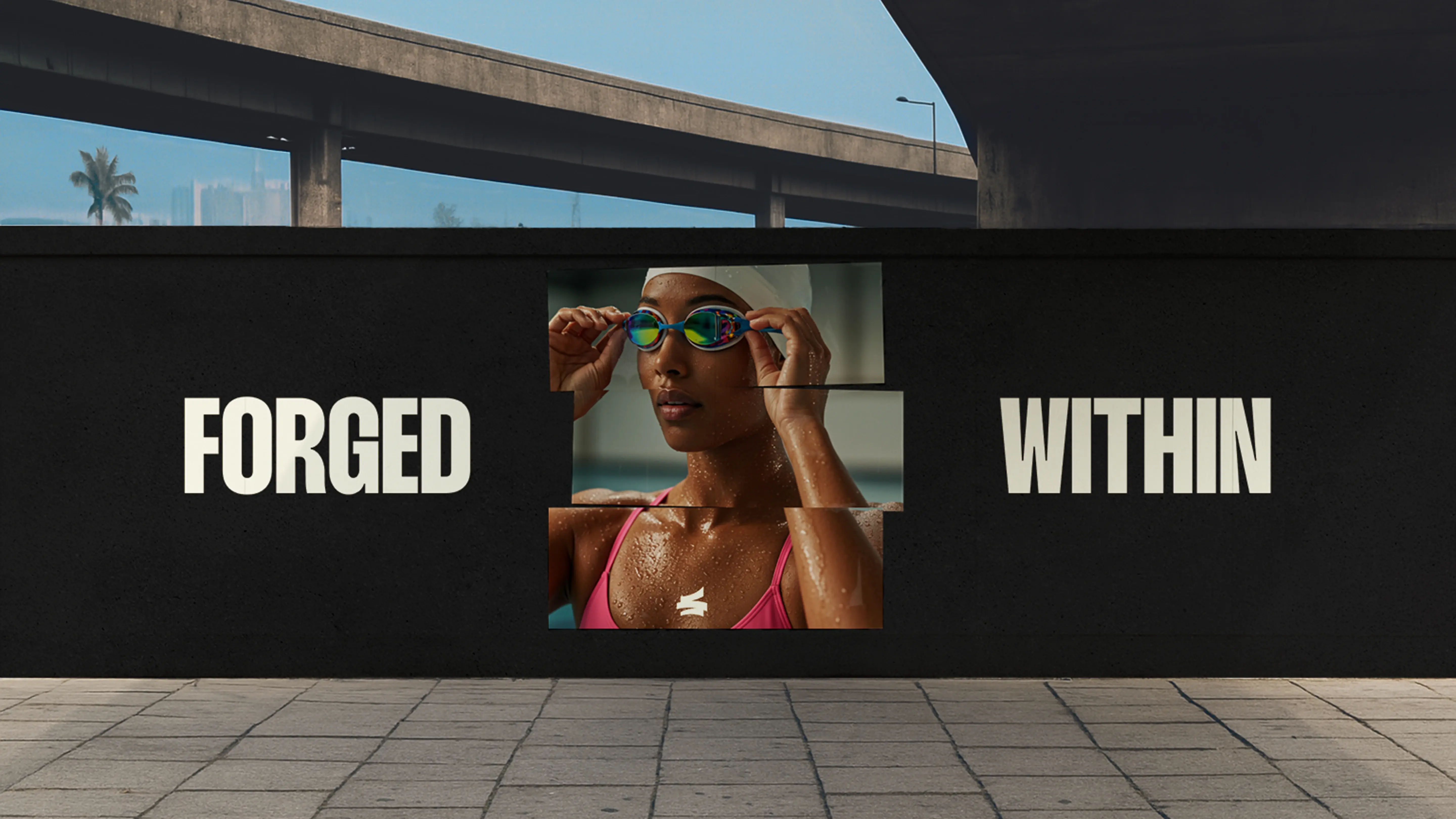
Greatness begins within
The soul of SÉON starts with a belief: greatness isn’t something you find, but something forged. This truth, shared by both co-founders, became the wellspring for the brand. Debbie, a swimmer and consistent meditator, described the discipline of inner stillness. Funbi spoke of the African fighting spirit, the fire that often burns long before the spotlight arrives.
Together, they embodied a powerful duality: mental clarity and unshakable drive. From that insight, we arrived at the brand’s core philosophy:
“Greatness begins within.”
It was more a declaration than it was a slogan. A declaration of mindset, preparation, and identity. It spoke to athletes still in the shadows, doing the work no one sees. It honored the process as much as the performance.
A brand forged from within
To bring that philosophy to life, we reached for an equally powerful metaphor: the forge.
The forge isn’t a place of ease. It’s a space of heat, pressure, and deliberate transformation—where raw material is shaped through force and fire into something refined. That became the design lens for the entire brand.
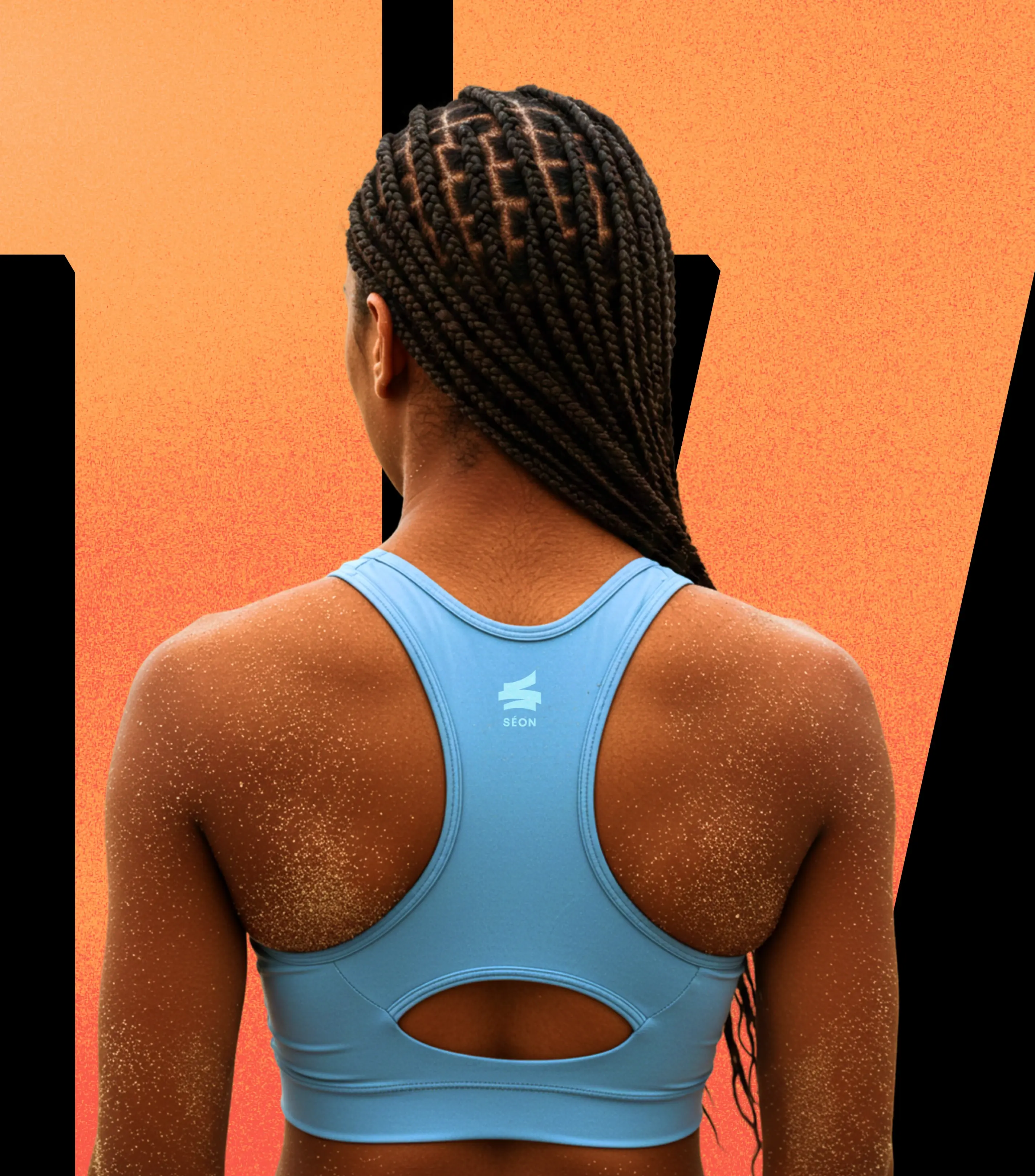
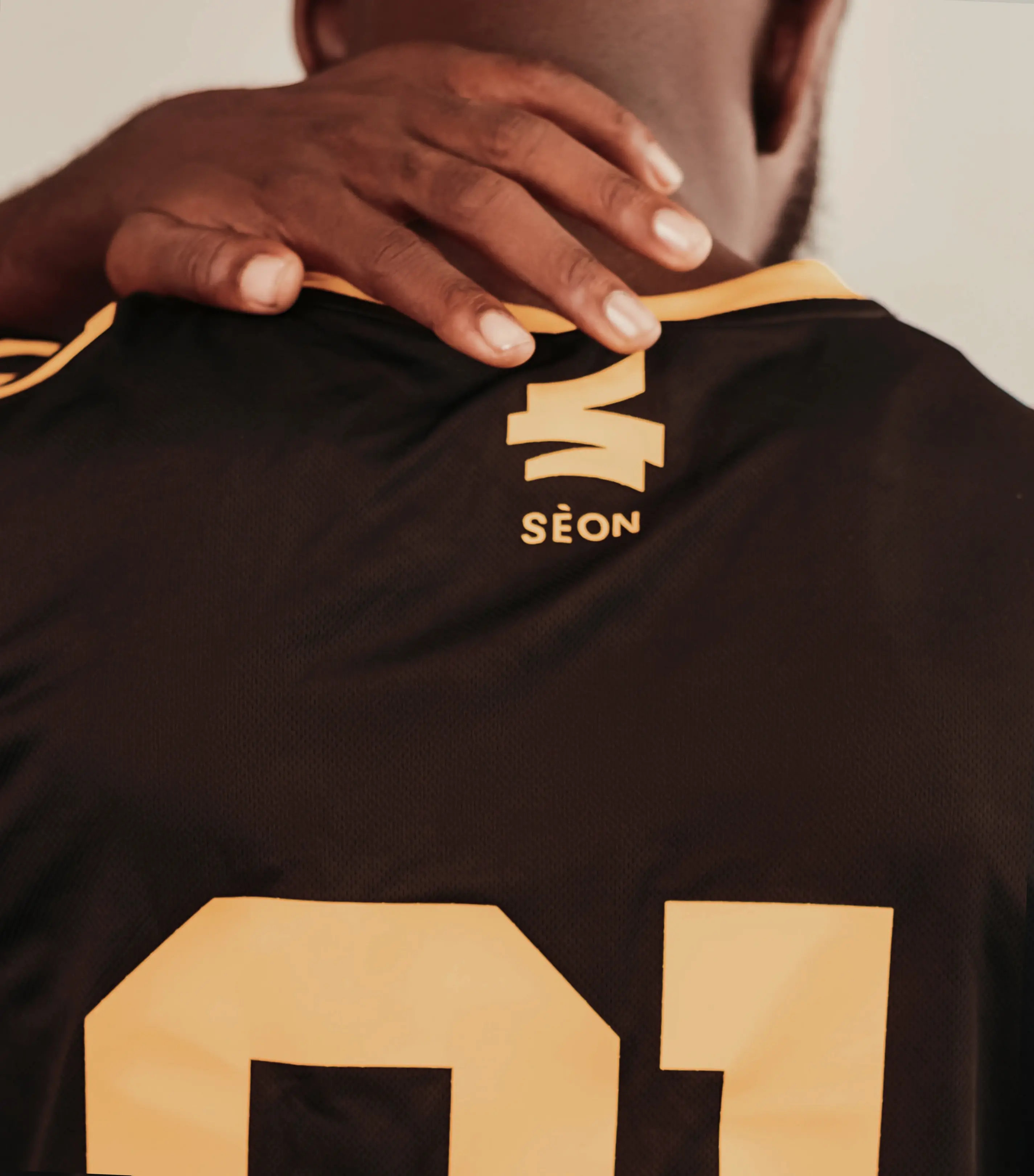
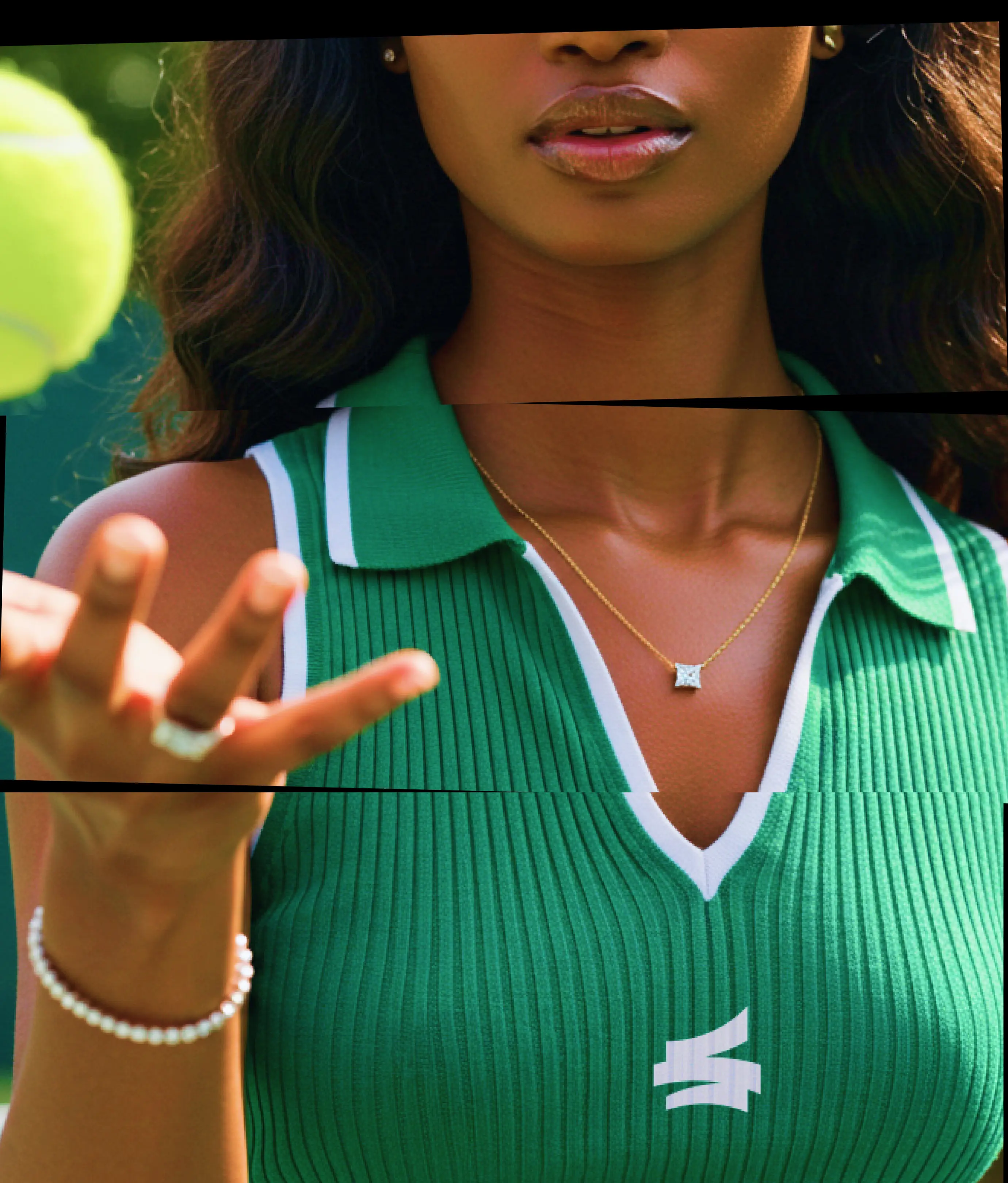
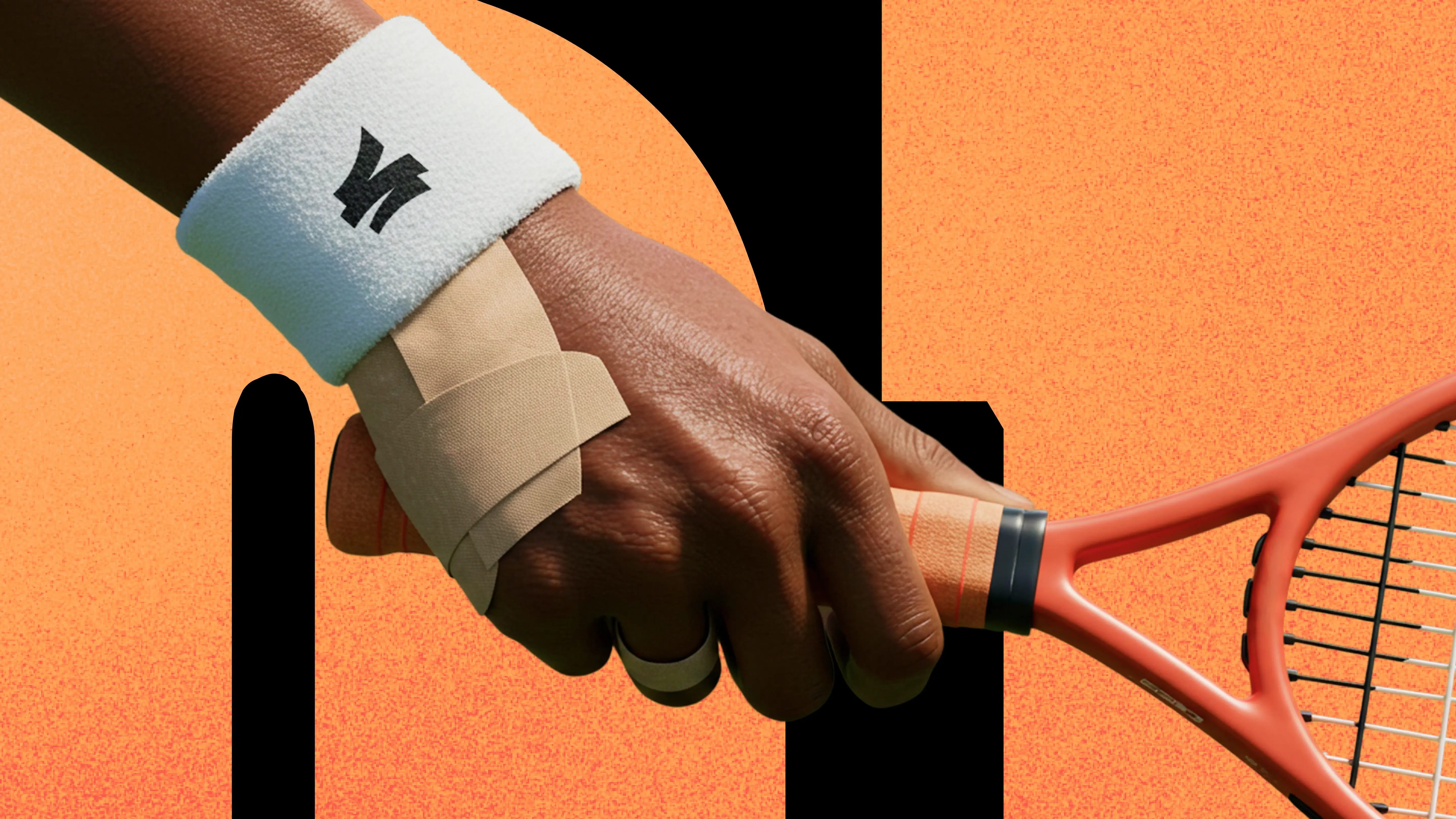
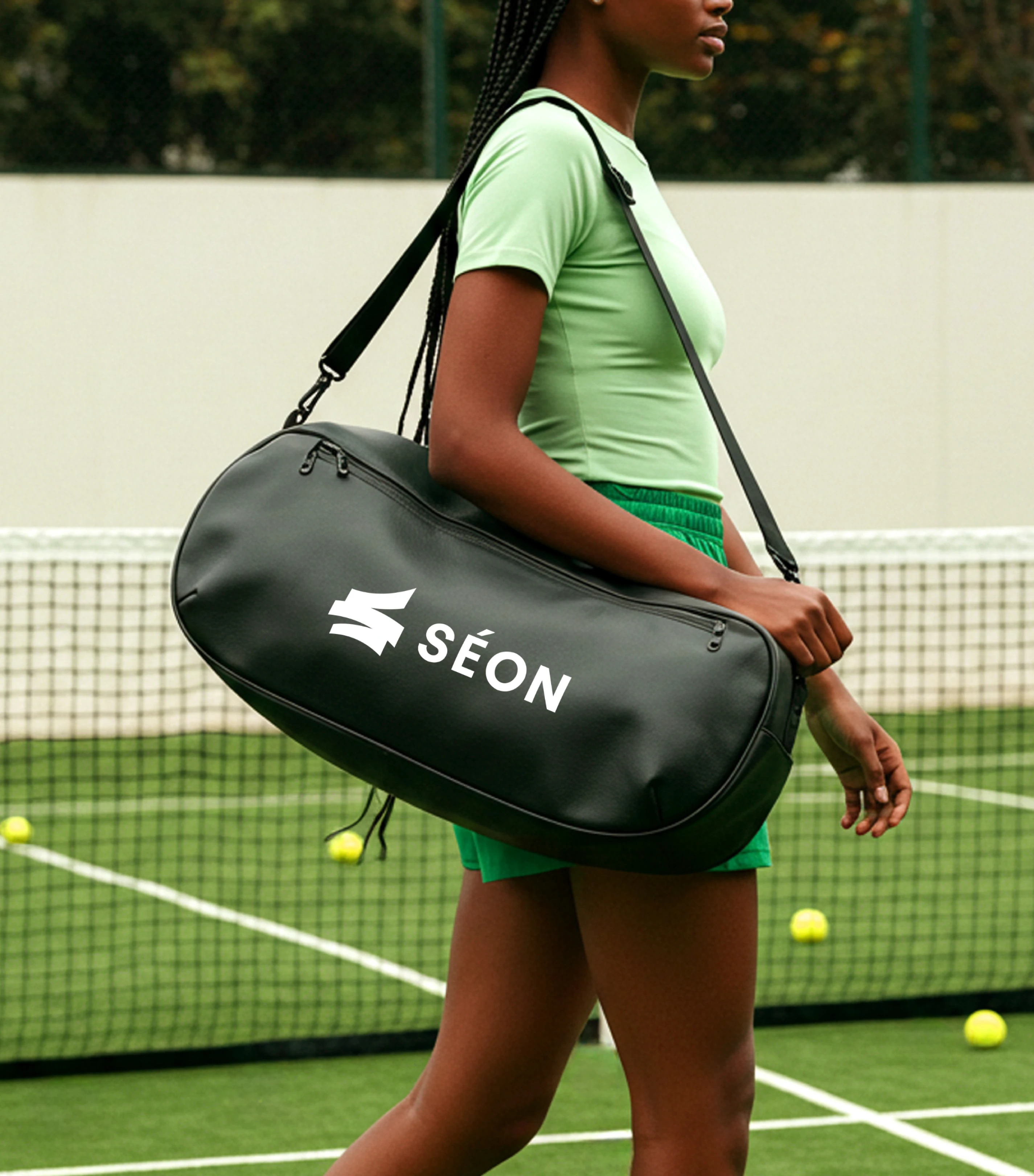
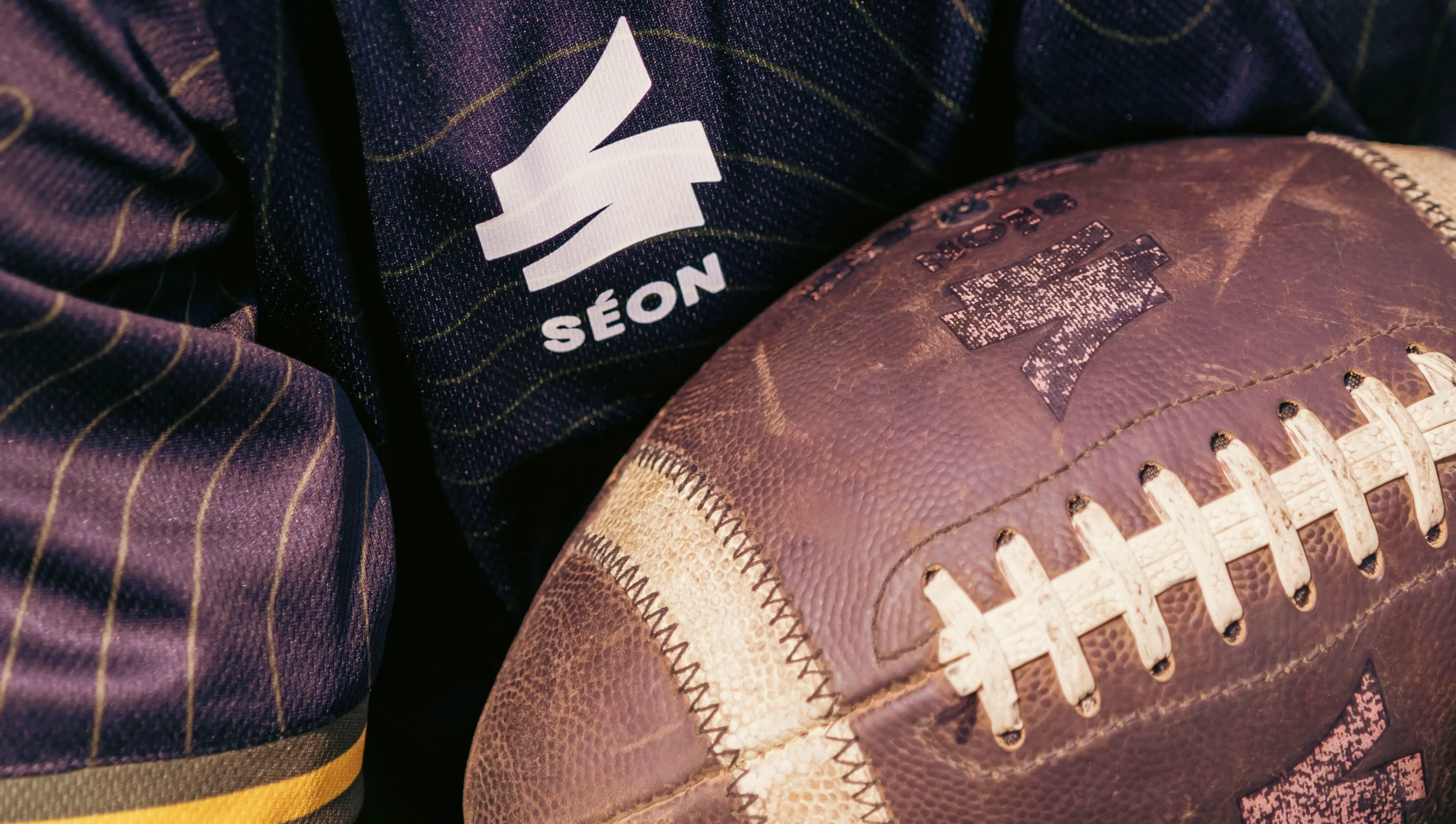
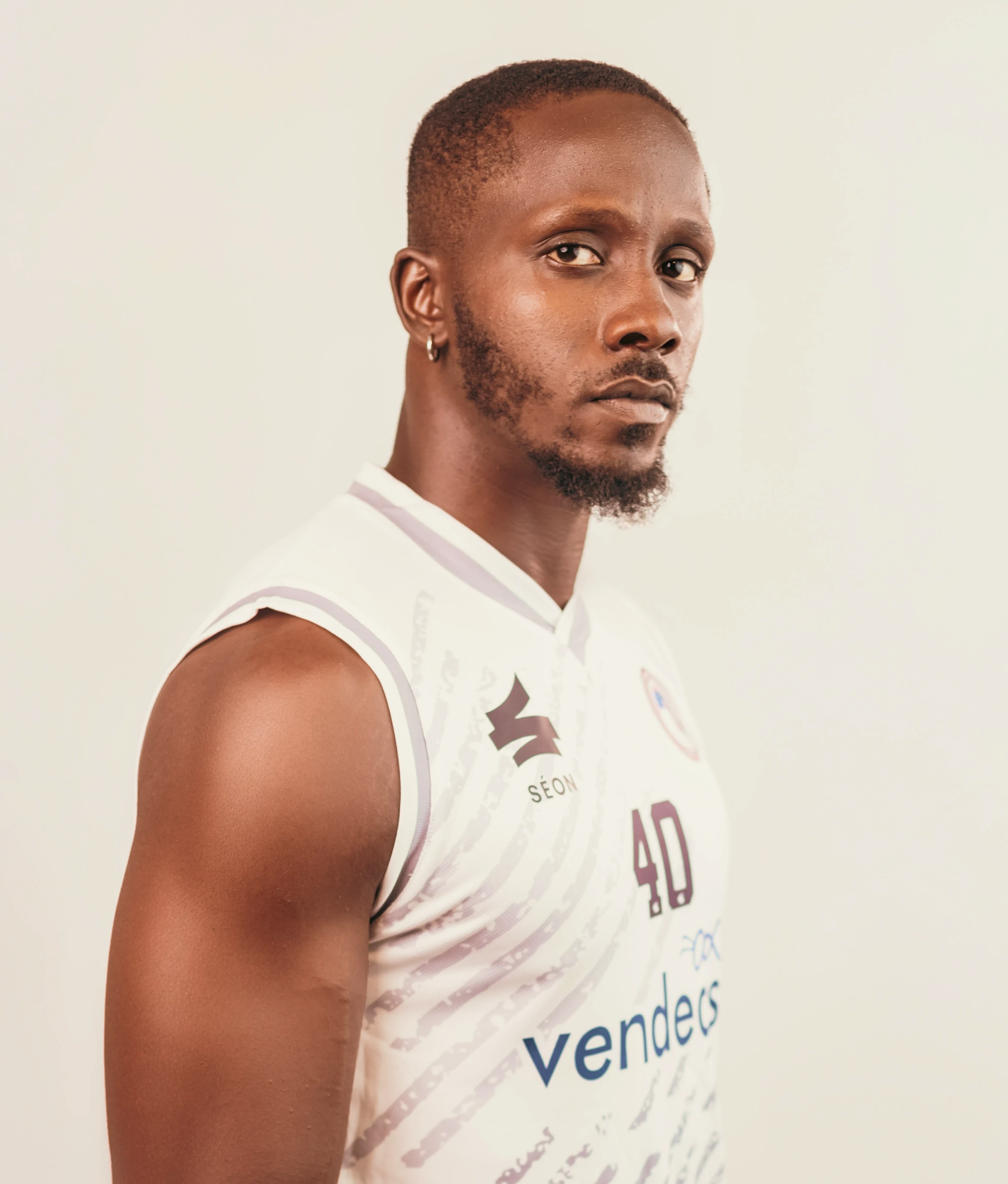
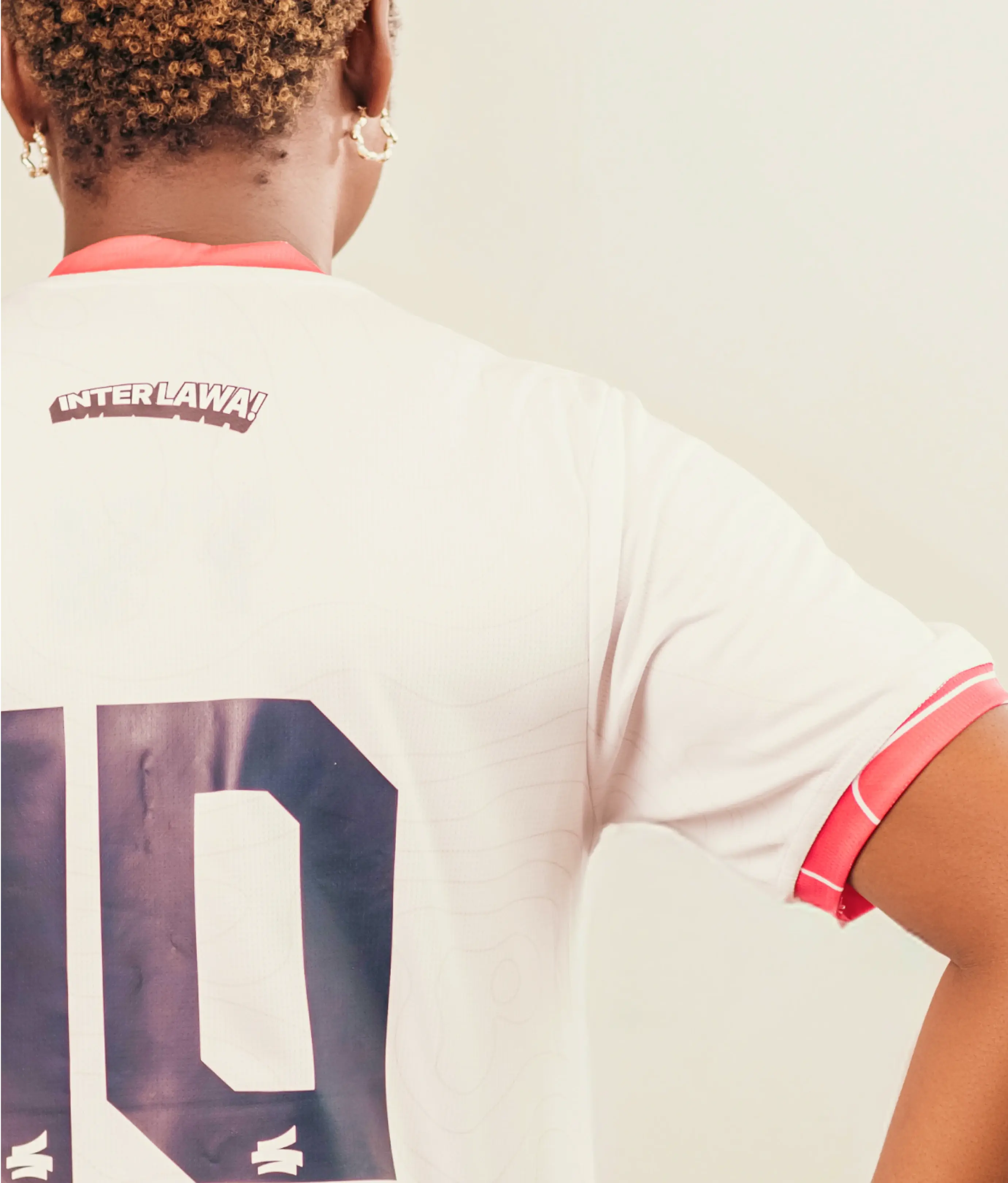
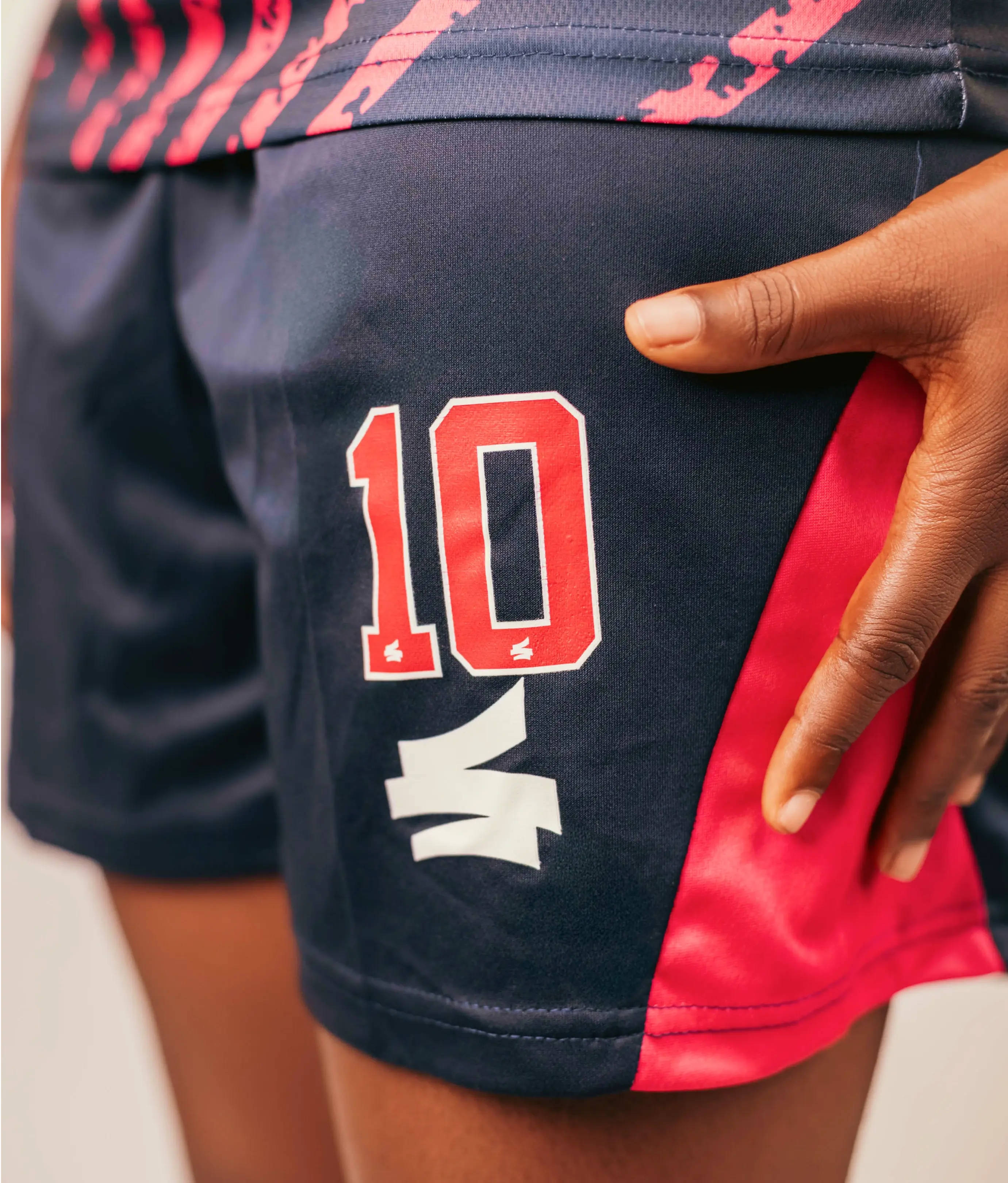
The logo takes its form from sword slashes; sharp, clean, and intentional, echoing the precision of martial arts and the discipline of inner mastery. At the center of it is an emblem built from three blade-like forms, carefully balanced drawing inspiration from carefully balanced rocks. Together, they suggest motion and clarity, while subtly forming the letter “S.”
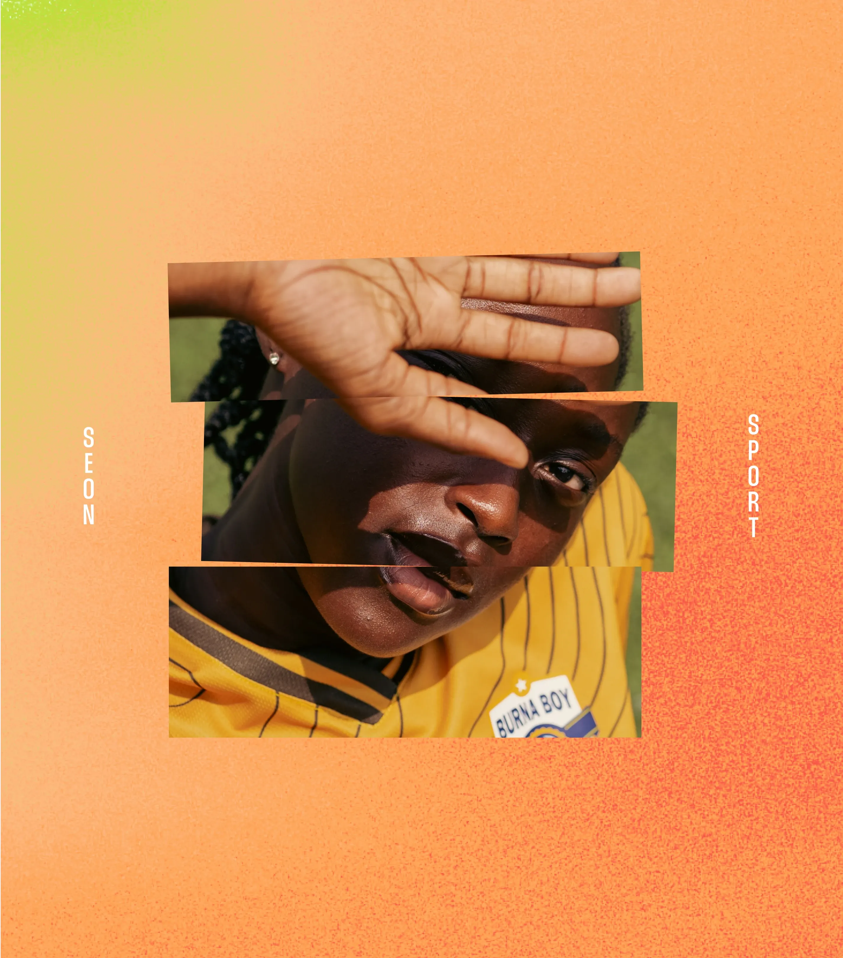
We introduced a signature visual texture called SÉON Lava. An expressive, molten pattern that captures the feeling of metal mid-forging. Its texture and glow mirror both the intensity of fire and the deep, unseen work that shapes greatness. It even hints at the hazy outlines of an ultrasound, evoking the inner world athletes build before the world ever sees them.
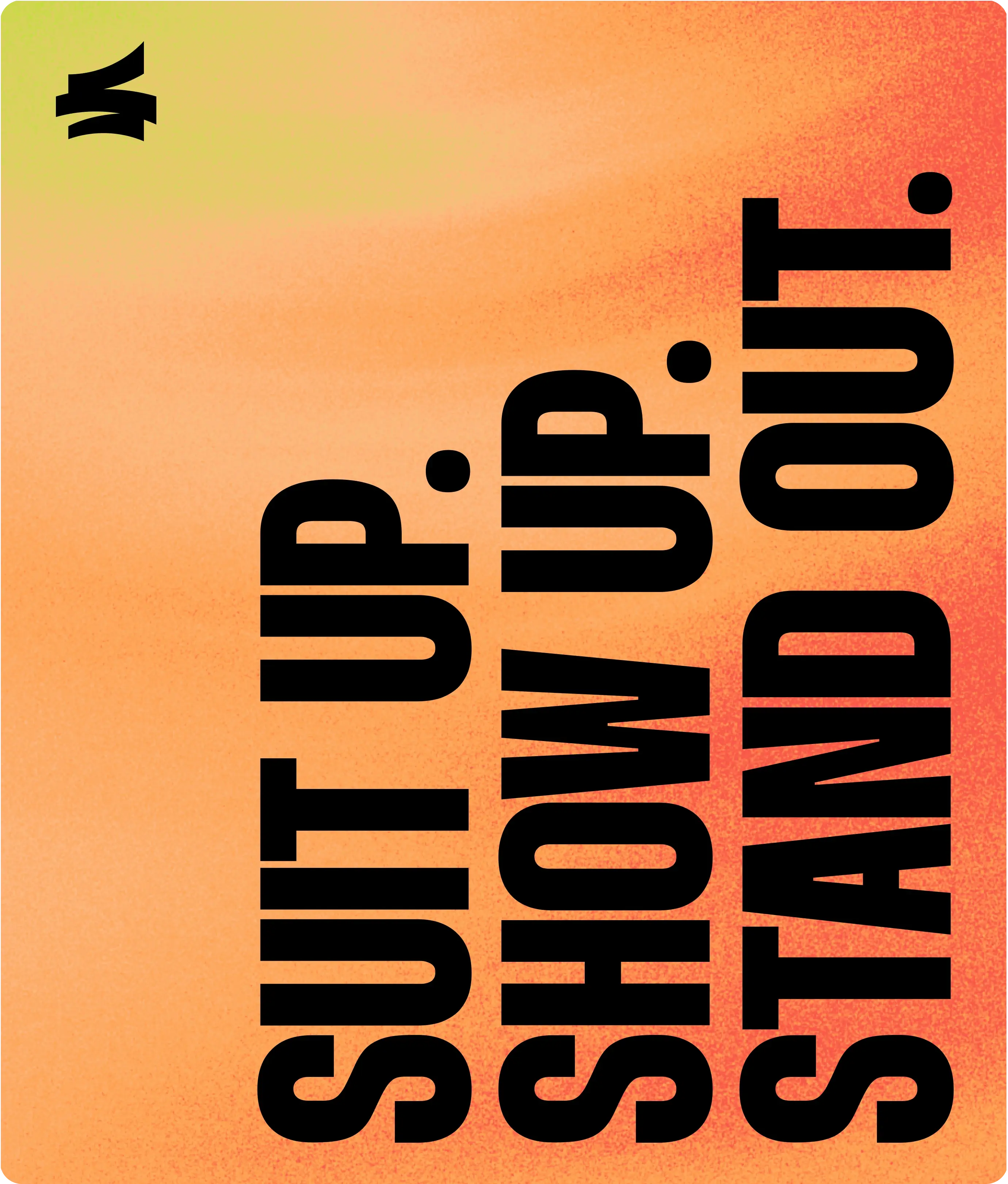
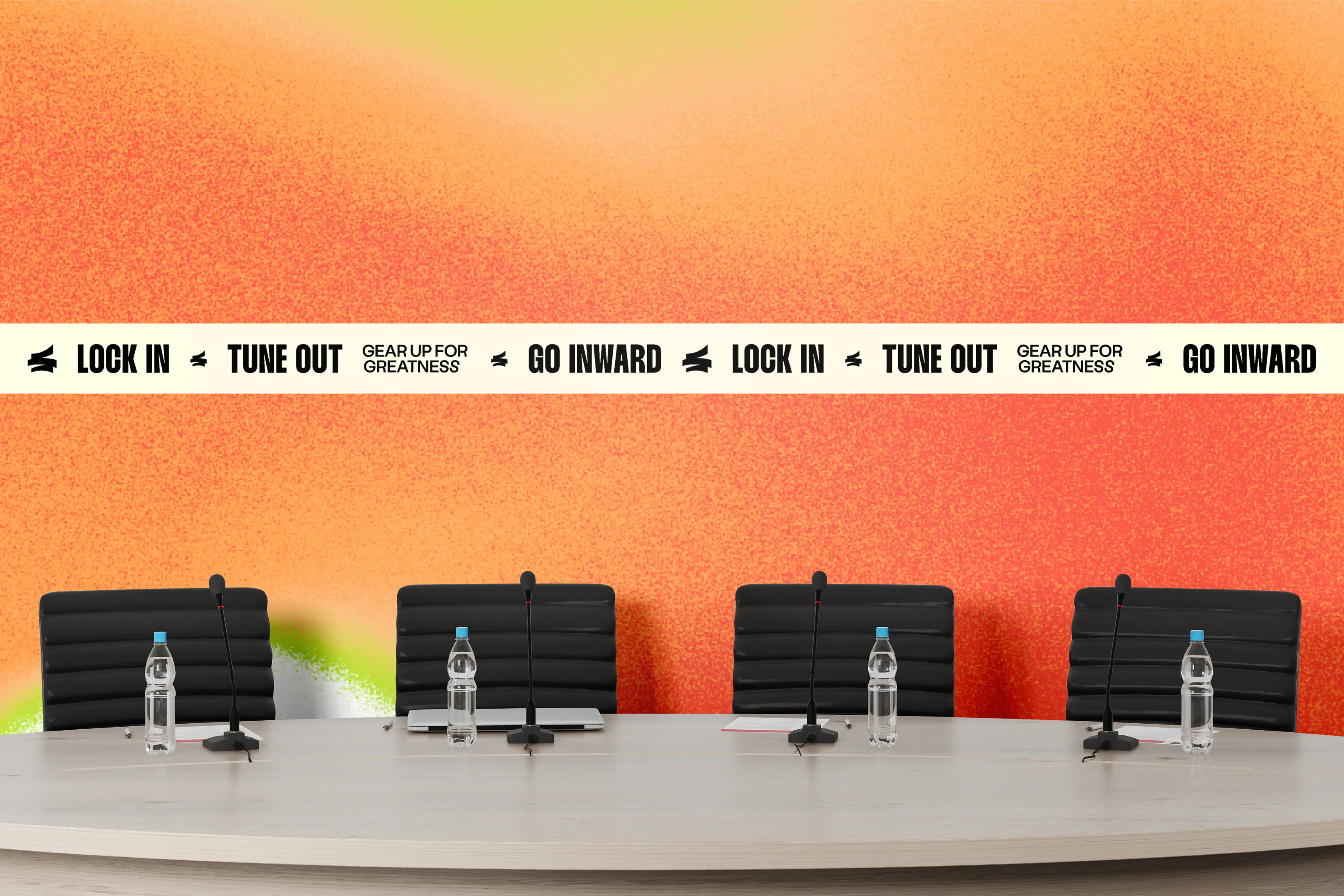
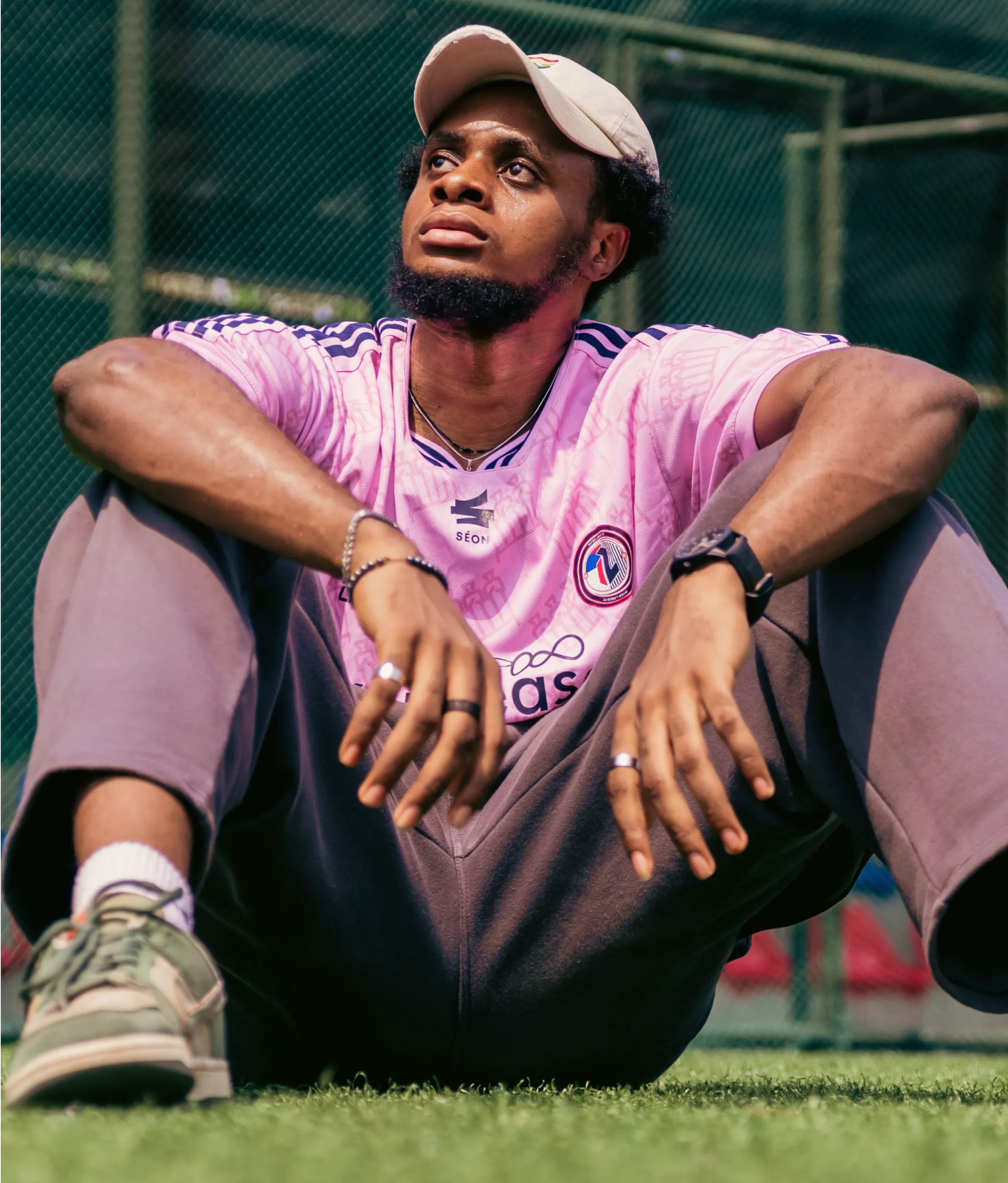
Color was pulled straight from the forge, deep embers, molten oranges, scorched blacks. Every shade chosen to carry the weight of pressure and progress. Typography, too, was treated with intention: bold, grounded, and clear.
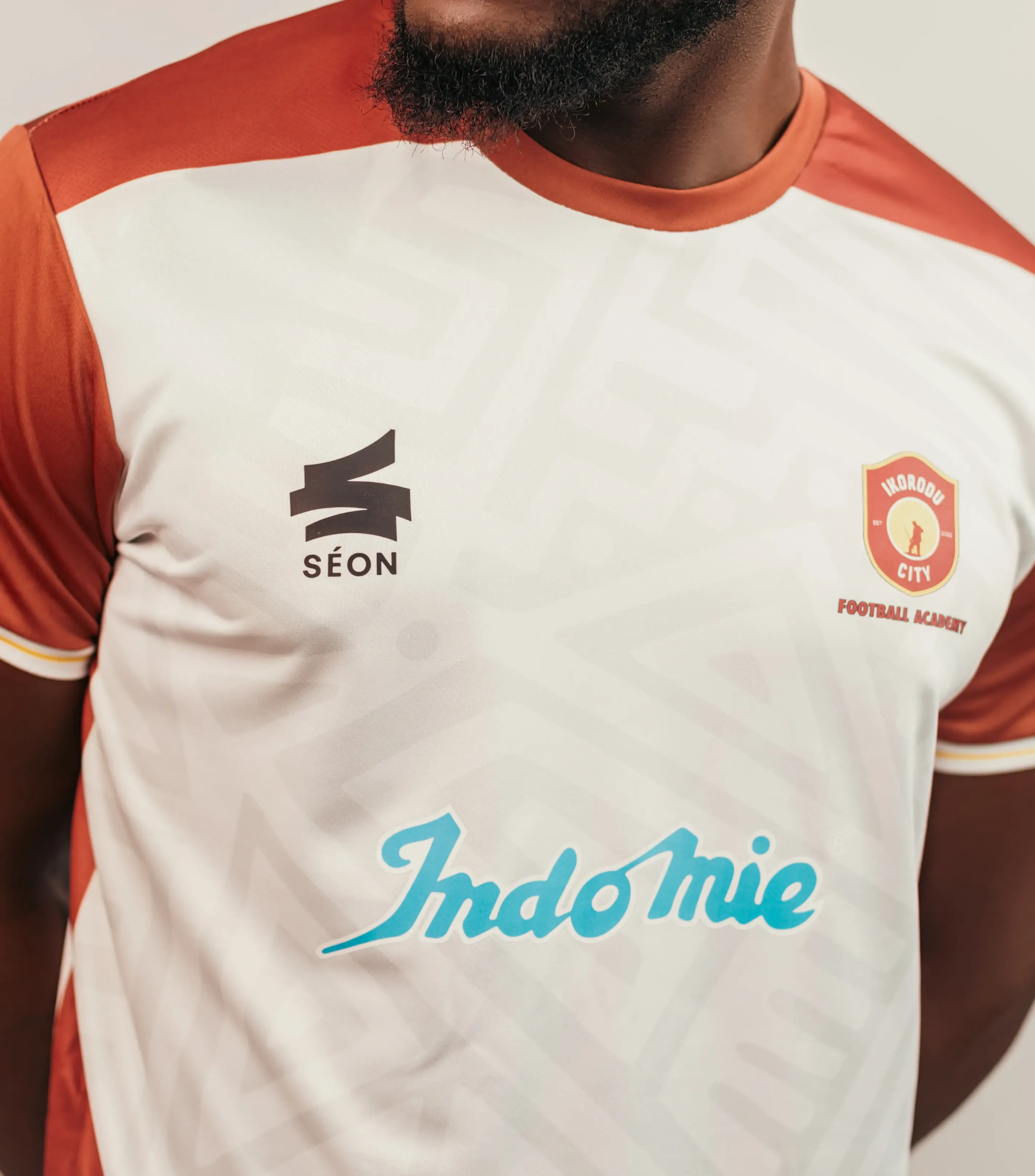
From the jerseys on the field to the messages on the sidelines, the entire system was designed to hold tension between inner stillness and outward power. To carry the feeling that this isn’t just style, it’s struggle. It’s sweat. It’s forged.